
What Are They Thinking ?
Decoding Shopper Behavior with Syrup CDTs
11/16/20253 min read
CDT Introduction
One of my all-time favorite analytics projects is running a CDT — Consumer Decision Tree — on a grocery category.
If you’re new to the term, a CDT is basically a visual map of how shoppers make choices within a category. It tells you what matters most at the shelf — attributes, brand, flavor, price, ingredients — and in what order those decisions happen.
In other words, it’s a window into the shopper’s brain. 🧠
Why do I love them? Because CDTs combine the science of data with the art of human behavior. They’re not just charts — they’re stories. You can use them to:
Identify gaps in a brand portfolio
Design smarter planograms
Spot emerging shopper trends
Or simply fuel great debates between category managers and brand teams about why people buy what they buy.
🍯 Why Pancake Syrup?
I don’t get to run these as often in my day job anymore — so I decided to do one for fun.
Free, public data is limited (and a little dated), but good enough for an experiment. I started with pancake syrups, because who doesn’t have an opinion about what goes on their waffles?
This post kicks off a multi-part series:
Syrup CDT (this one!)
Pancake & Waffle Mix CDT
Combined CDT — how the two interact in the real world.
Store Layout & Flow — how the aisle could evolve if we design it around how shoppers actually shop.
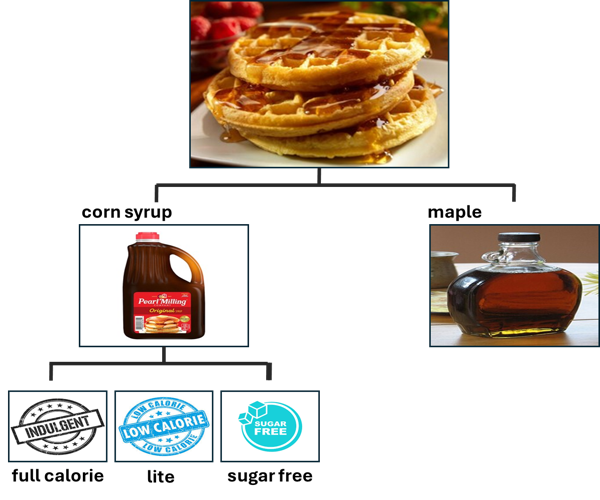
🧩 The Shopper Decision Tree: Syrup Edition
The syrup CDT turned out surprisingly straightforward. At the highest level, there are four key shopper decisions driving the category:
Maple Syrup
The “health halo” choice — seen as natural, premium, and often found in glass bottles.
Yes, it’s still sugar, but shoppers perceive it as the better sugar.
Higher price points suggest shoppers see it as a treat or investment in “real” ingredients.
Corn Syrup–Based Syrups
Honestly, this one surprised me. I used to assume these were just diluted maple syrups — but most are actually corn syrup blends.
Within this group, shoppers make decisions based on calories and sugar type:
Full Calorie
Lite / Reduced Calorie
Sugar Free
When you zoom out, the main fork in the road is clear:
👉 Natural sugars vs. processed sugars.
That’s the real decision behind the syrup shelf.
Calories alone don’t explain it — both maple and corn syrup hover around 110 calories per serving. But perception does: maple syrup carries that “natural, authentic” vibe, while traditional syrups win on price and familiarity.
🕵️♂️ Why CDTs Are So Addictive (At Least to Me)
Once you have your switching data, you can cluster products by behavior. The beauty? The data forms the clusters itself. My job is to decode the “why.” Sometimes the story jumps off the page (e.g., brand loyalists vs. calorie watchers). Other times, you have to dig — into ingredient lists, packaging, attributes and price points — to uncover what makes shoppers group items together. Every cluster tells a story if you’re curious enough to listen.
🧃 What’s Next?
Next up: Pancake & Waffle Mixes.
I’m especially curious to see what happens when we combine both categories — for instance, do Kodiak’s high-protein mixes pair more with maple syrup or sugar-free syrup buyers?
I’ll also explore store layout flow — how these categories should ideally sit together to make shopping more intuitive (and maybe increase basket size while we’re at it).
💬 Your Turn
Does any of this surprise you?
Do you see different patterns in your own data or stores?
I’d love to hear from category managers, brand teams, or fellow data nerds — what would you expect to see in a pancake CDT?
Contact
Contact me for questions, comments, suggestions or anything else!
info@eurekadatalab.com
© 2025. All rights reserved.